- The Queen Unseen Archive at the Art Gallery of Ballarat, go and see it! it looks amazing.
- Novo were after some more high-res digital prints for their seasonal internal displays.
- We also installed the new corporate id for ‘The Art Gallery of Ballarat’
- Maple Street Early Learning Centre were after a couple of banners to let parents know that they were taking enrolments for their kindergarten.
- Melbourne Uni Student Union required a new illuminated cubed information sign, she lights up a treat.
- Palms Pharmacy– situated in sunny Coffs Harbour invested in seasonal promotion signage. Looks great!
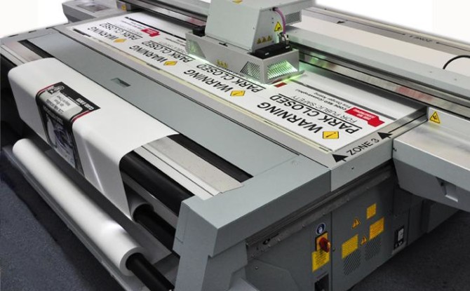
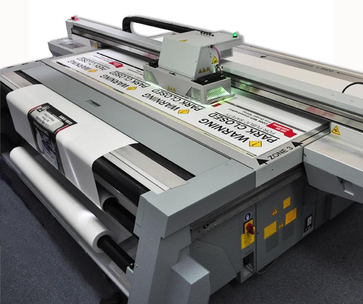 ::MSC:: have joined the new wave of printing, with todays standards and high demands we certainly are ahead of the game. Since the purchase of our OCE 350GT UV flatbed printer with roll to roll printing on 1.6m wide flexible media business has never been better. Printing on most ridged substrates the 2500×1250 flatbed will complete a ripped job in no time, so you can only imagine the turn around. A wise investment to bring MSC signs into the forefront.
